Monday, 16 March 2015

Critique on new Designs

Today was another critiquing session. There was some positive feedback in terms of the ideas I was trying to get across. The colour schemes proved be quite effective and when put together comparative emotions could be felt.
The line work was admired however it was advised that from a distance the Bodega line works looked like straws, and in combination with the Alt-J esque triangle motifs made it look like the performer had some freaky wings protruding from their neck. The Botanic Garden linework was also suggested to be less wavy and more smooth, keeping the wave but making it look less upbeat and rapidly changing will help to add to the more chilled vibe I'm going for. The leaf designs on that particular image was well received.
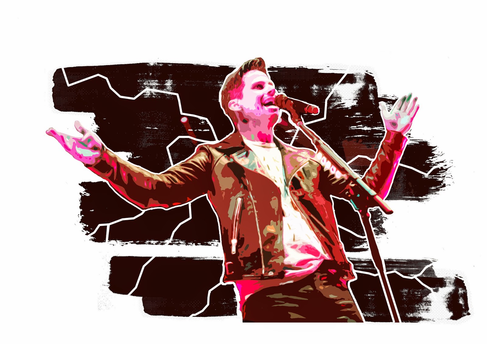
Important critique involved the fact that these all more or less demonstrate faces and people, and the focus should be somewhat on the locations. I was aiming to make them somewhat unidentifiable in terms of face, but sitll have some features key to a general act that would play at these locations, in terms of the TSB I gave him a very  edgy yet still mainstream pop artisty feel, but I was quickly reminded there are more than pop acts that play here.
I played with covering the face with a dynamic intricate pattern on the Bodega piece, but it was still received as having an identity, and some said I should remove the top half of the face entirely.
About the Botanic's representative, some said a saxophonist/trumpeteer would suit more, however I felt like the bass was a more mainstream and less specific instrument to go with, something that encompasses all, however, I will still experiment with these ideas. The same critique in terms of facial identity went here, however I was commended for a somewhat silhouette-like design which helped remedy this.

Friday, 13 March 2015

Imagery


Been hard working on some half illustrative half photographic imagery for the brochure. Stuck to the strong colour schemes and used some linework to help really emphasise the feelings. Will be presenting these on monday's class.

Wednesday, 11 March 2015

Thumbnailing

Sketching out thumbnails with some inspirational images. At this point I think to work with the activities I've chosen I'll be using a landscape format, but we'll see how it all works out further down the road with some more solid imagery.

Tuesday, 10 March 2015

Feedback

Feedback on my images was mixed.
More work obviously needed to be done. Experimentation with line width was recommended, especially in regards to the two TSB pieces.
The Botanic garden piece was said to be quite creepy, and snake looking, have to rethink the vine line motif.
Overall some good feedback in terms of the linework and colour, some more image rendering could be used, a little bit more to everything in general.

Saturday, 7 March 2015

Botanic Garden Venue Visit


A couple of friends an I went to the Botanic Gardens, we got a couple of photos, so I thought I'd repurpose them as research in terms of colours and motifs, as well as a map that I could use somehow? Lots of greens obviously, and it was a lovely day so everything was soaked in sun. Great place for a nice chilled jazzy vibed concert.

Thursday, 5 March 2015

Further advancement

Adding further detail and working with lines to emphasize mood and feeling. The lightning motif feels strong in terms of portraying energy, but perhaps it could be construed as threatening?
The top left is a simple photo with some simple illustration, but it definately feels the strongest.

Wednesday, 4 March 2015

Some initial ideas


Today was a day for gathering ideas and trying to put them together, came up with some colours that I felt juxtaposed each other and represented the locations respectively. Playing with ground textures and crowd activities/actions.