Monday, 30 March 2015

Rational

For my subject matter I chose to do live music venues in Wellington.
Wellington is a city alive with creativity and passion, and what better accumulation of both of those attributes than music. Amongst the tall buildings, and suits with places to be, surrounded by what some people would call a "dying city" (thanks John) we have some great venues to go and take in the atmosphere and listen to some pretty sweet jams.
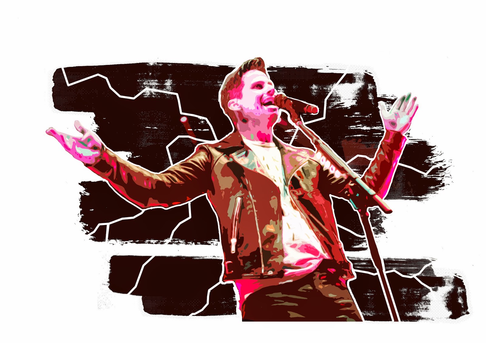
TSB Arena, is your premiere venue when it comes to the mainstream, you'll get some pop, you'll get some rock, maybe a lil hip hop or R&B. It's loud and always filled to the brim with people and some solid vibrant 'in your face' energy.
The Botanic Gardens is a great place for a summer afternoon/evening with your friends/family, a place to chill out amongst nature, sit on the grass have a chat, and let the smooth jazzy vibes wash over you.
Bodega is the hipter-est joint in town, hosting some unknown names that you know is gonna bring the alt, it's spacey, out there, a good place to catch up with mates and experience something new and maybe a little odd.
I've worked towards communicating these ideas in my spreads through my colour, use of subtle symbolism, and how they're all arranged on the page. The gridwork and typography allow for a clean and professional look for a booklet, while the imagery stands out on their respective pages, communicating the feelings and vibes of their locations. 
In terms of font, I chose modern, bold and capitalized for headings, something you'd see on many band posters/albums, a sans serif type for the body copy (the microsoft equivalent of univers) was to ensure readability and harmony with the other themes of the design. For the subheadings, something a little more edgy and hipster, to give everthing a little bit of wellington personality.


Sunday, 29 March 2015

Finalizing and Printing


The finalized spreads of my booklet ready to be printed, I've chosen to deal with Fullstop for printing.
Today will be for picking out paper, testing colour prints and finalizing the physical booklet.

Saturday, 28 March 2015

Fonts

Fonts used were
Bebas Neue for headings
Lighthouse for subtitles
Calibri for body (closest thing microsoft has to Univers)

Friday, 27 March 2015

Some needed changes

Over the past few days I have created the extra pages for the booklet, in the style of the three spreads. This is of course after refining the spreads, putting some work into the gridding and typography and redoing the illustrations.
All the changes that were suggested I experimented with and for the most part worked really well for what I'm going for.
The product as it stands feels clean and professional, and the imagery is communicating what I'm trying to. I've asked various non-design people, to get their thoughts on the mockup brochure, as a way of testing to see if the intention is well communicated to the target audience (any given person, perhaps looking to visit wellington).

Thursday, 26 March 2015

Iconography

Creating icons to use in the brochure
They signify the crowd size, the level of hipster-ness (wouldn't be a wellington activity without a hipster measure), and the level of energy that is produced in the performance.

I've also been further refining typography and playing with the imagery some more, just to figure out how to incorporate all elements onto the spread to give a good sense of design communication and good visual flow.

Monday, 23 March 2015

Critique interim

After hanging our work up on the "north wall", we all examined each others work and the critique I received from my group was as follows.

The really like the ideas, the illustrated people versions worked better than the versions with a more symbolic approach. However they'd like to see cleaner illustrations.

More direction was required in the TSB arena version, because it felt a little put on the page.
They did however think that this illustration was the strongest and portrayed a good sense of excitement and energy.

The typography obviously required a lot of work and formatting, it was too large, there was too much, and it was generally quite messy. Grid work needed to be concentrated on a lot more aswell.

The Botanic gardens one required some more subtle depth but otherwise it was agreed that it was currently the strongest of the options.
Second strongest was the Bodega version, but some of the line work on the guitar needed to be stronger.

Monday, 16 March 2015

Some edits from critique


Just playing around with now concealing faces in interesting ways.

Critique on new Designs

Today was another critiquing session. There was some positive feedback in terms of the ideas I was trying to get across. The colour schemes proved be quite effective and when put together comparative emotions could be felt.
The line work was admired however it was advised that from a distance the Bodega line works looked like straws, and in combination with the Alt-J esque triangle motifs made it look like the performer had some freaky wings protruding from their neck. The Botanic Garden linework was also suggested to be less wavy and more smooth, keeping the wave but making it look less upbeat and rapidly changing will help to add to the more chilled vibe I'm going for. The leaf designs on that particular image was well received.
Important critique involved the fact that these all more or less demonstrate faces and people, and the focus should be somewhat on the locations. I was aiming to make them somewhat unidentifiable in terms of face, but sitll have some features key to a general act that would play at these locations, in terms of the TSB I gave him a very  edgy yet still mainstream pop artisty feel, but I was quickly reminded there are more than pop acts that play here.
I played with covering the face with a dynamic intricate pattern on the Bodega piece, but it was still received as having an identity, and some said I should remove the top half of the face entirely.
About the Botanic's representative, some said a saxophonist/trumpeteer would suit more, however I felt like the bass was a more mainstream and less specific instrument to go with, something that encompasses all, however, I will still experiment with these ideas. The same critique in terms of facial identity went here, however I was commended for a somewhat silhouette-like design which helped remedy this.

Friday, 13 March 2015

Imagery


Been hard working on some half illustrative half photographic imagery for the brochure. Stuck to the strong colour schemes and used some linework to help really emphasise the feelings. Will be presenting these on monday's class.

Wednesday, 11 March 2015

Thumbnailing

Sketching out thumbnails with some inspirational images. At this point I think to work with the activities I've chosen I'll be using a landscape format, but we'll see how it all works out further down the road with some more solid imagery.

Tuesday, 10 March 2015

Feedback

Feedback on my images was mixed.
More work obviously needed to be done. Experimentation with line width was recommended, especially in regards to the two TSB pieces.
The Botanic garden piece was said to be quite creepy, and snake looking, have to rethink the vine line motif.
Overall some good feedback in terms of the linework and colour, some more image rendering could be used, a little bit more to everything in general.

Saturday, 7 March 2015

Botanic Garden Venue Visit


A couple of friends an I went to the Botanic Gardens, we got a couple of photos, so I thought I'd repurpose them as research in terms of colours and motifs, as well as a map that I could use somehow? Lots of greens obviously, and it was a lovely day so everything was soaked in sun. Great place for a nice chilled jazzy vibed concert.

Thursday, 5 March 2015

Further advancement

Adding further detail and working with lines to emphasize mood and feeling. The lightning motif feels strong in terms of portraying energy, but perhaps it could be construed as threatening?
The top left is a simple photo with some simple illustration, but it definately feels the strongest.

Wednesday, 4 March 2015

Some initial ideas


Today was a day for gathering ideas and trying to put them together, came up with some colours that I felt juxtaposed each other and represented the locations respectively. Playing with ground textures and crowd activities/actions.

Monday, 2 March 2015

Direction, Rhythm, Contrast. Portrays a sense of excitement, larger than life invigoration, adrenaline.
Understanding key elements in an image to understand how it portrays the feelings it does. I really want to harness this.
Young and Sick, a band that also produces some cool illustrations, have a neat way of doing caricatures. I thought I could do something similar showing the stereotypes of people that attend the various events.


Today the feedback was that different approaches other than a literal interpretation of the events/venues should be taken. Thinking of ways to draw feelings and mood out of my selected event/venues and I've decided they differentiate in sound, mood, the act, the crowd (the type of people), lighting and spacing.
I want to try a more illustrative style to tie these all in together, I think that it's something that could really suit the theme if perhaps combined with some photography.
Currently looking at drawing inspiration from various concert posters, the SmokeFree RockQuest advertisements, as well as art from various album covers, and band websites.
The following are examples of the sort of style I wish to approach the illustrative side of things with. I feel like this can be used to express a range of emotions in both literal and non literal ways to help get my message across.


Sunday, 1 March 2015

Live Music Wellington

-TSB Arena, Headline act


-Botanical Gardens, Chill Jazz


-Live music bar, Bodega


Sunday, 22 February 2015

Ideas

1-Live Music Venues
a)-ASB Arena/Westpac Stadium
b)-Botanical Gardens
c)-Club/Bar (Bodega/Puppies/Pyramid)

Invoked Feelings
a)-Loud, energetic, dark, lights, audience is part of performance, headlining acts, famous bands, fanatics, line jagged, sharp, changing constantly.
b)-Calm, quiet, peaceful, a place to have a drink and a casual conversation, jazz vibes, smooth line, flows nicely.
c)-Somewhere in between, a place for the unknown to give it a shot, performers still feed off audience, but audience can still drink and talk, discovery, a somewhat erratic line, in between the smooth and jagged, the middle ground.


2-Markets
a)-Friday Night Market, Cuba Street
b)-Saturday Craft Market, Underground Carpark
c)-Sunday Morning Market, Waterfront

Invoked Feelings
a)-Dark, lights dotting, compact, closed in, bustling, very singular in its crowd, cacophony of noises, live music, guitar and voice, the smell of food everywhere.
b)-Slight dimness, but not a total dark, crafty, feels more handmade, quieter, very put together, perhaps the odd conversation, the odd food stall.
c)-Bright, big sky, sun shining, clouds glistening, blue, open, free, walk anywhere, fresh produce, colour, vibrancy, casual, the sound of people and the ocean, pleasant.